Role
Product Design Lead (UX)
Client
Alterra Mtn. Co.
Ikon Passholder Portal
Transforming a simple eCommerce backend into a useful passholder portal for multi-resort skiers & snowboarders.

Shifting a once-a-year customer touchpoint into an ongoing relationship.
Over a multi-year engagement, I guided the UX approach for Alterra Mountain Company's evolving product portfolio including Ikon Pass eCommerce & checkout, destination websites, the passholder portal, and a reservation booking system during COVID-19.
Ikon Pass is a multi-destination ski & snowboard pass that provides access to 48 ski resorts around the world (16 owned / 32 partners). Every year hundreds of thousands of powder enthusiasts snap up their pass and lock in for a season of stoke.
This case study focuses on the Ikon Passholder Portal (My Account), where I was an embedded Product Design Lead working alongside Alterra's Product Manager and agile development team.
Upon inheriting a simple shopping backend, I realized an opportunity to build a transformative product experience - shifting a single sale touchpoint into a relationship that could evolve as the season unfolded.
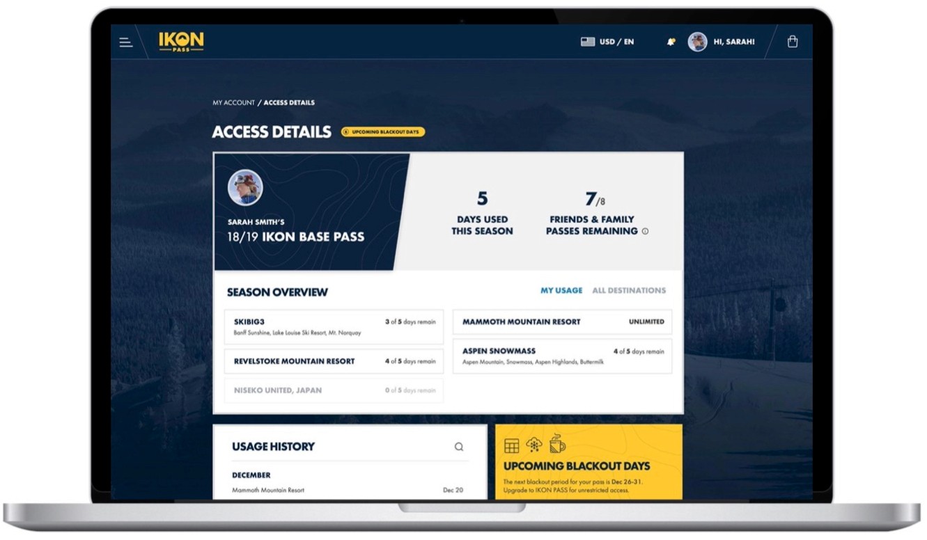
The feature that started it all.
One of the features I was initially asked to design was an Access Details (aka pass usage) page, so passholders could see which resorts they could access, as well as how many days they had remaining.
Although the view was quite straightforward, the potential to make this a more central feature of the platform became clear — and so I began to pull on that thread, and a larger opportunity began to take shape.

Most desired pass information, according to survey respondents:
#1 - Total Days Used (63%)
#2 - Days used for each resort (63%)
#3 - Destination access information (46%)
#4 - Friends & family passes remaining (40%)
Working in tandem with another designer, we prepared two distinct concepts for a new passholder experience that would put usage front and centre.
I then led a modified GV Sprint workshop with senior client stakeholders in Denver, Colorado. We discussed the concepts as a team and voted on which features and requirements to prioritize.


UI Design & Prototyping
With survey results and client feedback in hand, I proceeded to design the new user interface. With COVID-19 sending everyone to work from home, I migrated to Figma for the improved collaboration features.
Following the lead of the marketing team, I implemented a simplified visual design language that moved away from the heavy-handed and distracting textures that had previously dominated the design.
I also expanded the content area by moving the navigation bar to the top of the page, creating more space for the user's content.
Finally, I introduced a new feature that used cards to showcase the snow conditions at the user's favourite destinations.
The results
80% of listings renewed in the first 4 months
282% surge in traffic following launch
6500+ listings migrated without major issue
6 API distribution partners connected
+12 point improvement to NPS
Next steps
Tge new design provided a foundation for the organization to launch new initiatives during the altered pandemic season including their Adventure Assurance program, and a mountain reservation system.